Critical reflection:
My website is responsive and easy to navigate on a variety of different form factors. Navigating the website is simple and satisfactory, there are button shortcuts to get to certain sections or blog posts on the website and a top button to go back to the top of the website. This makes navigation swift and easy. All external links also open on new pages allowing the user to tab between the website and external linked websites for later read. The theme is carried out throughout the webpage. The only apparent flaw with the website is white space at the bottom of the page. If there is white space on the sides the user must press home or link to any other page, then go back to the page they were reading. This is only needed when constantly changing from one form factor to another and not when loading it directly to that form factor. The layout of the webpage itself changes to suit that of mobile use. All in all the website has successfully captured the cyber punk aesthetic I was going for. The target audience of this website is people in the game design/creative industry that is seeking creative individuals like myself “that challenge pre-set conventions” to portray my artistic expression.
Rationale:
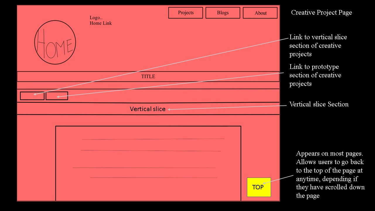
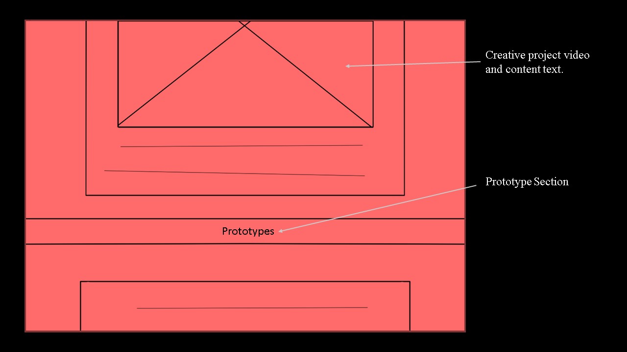
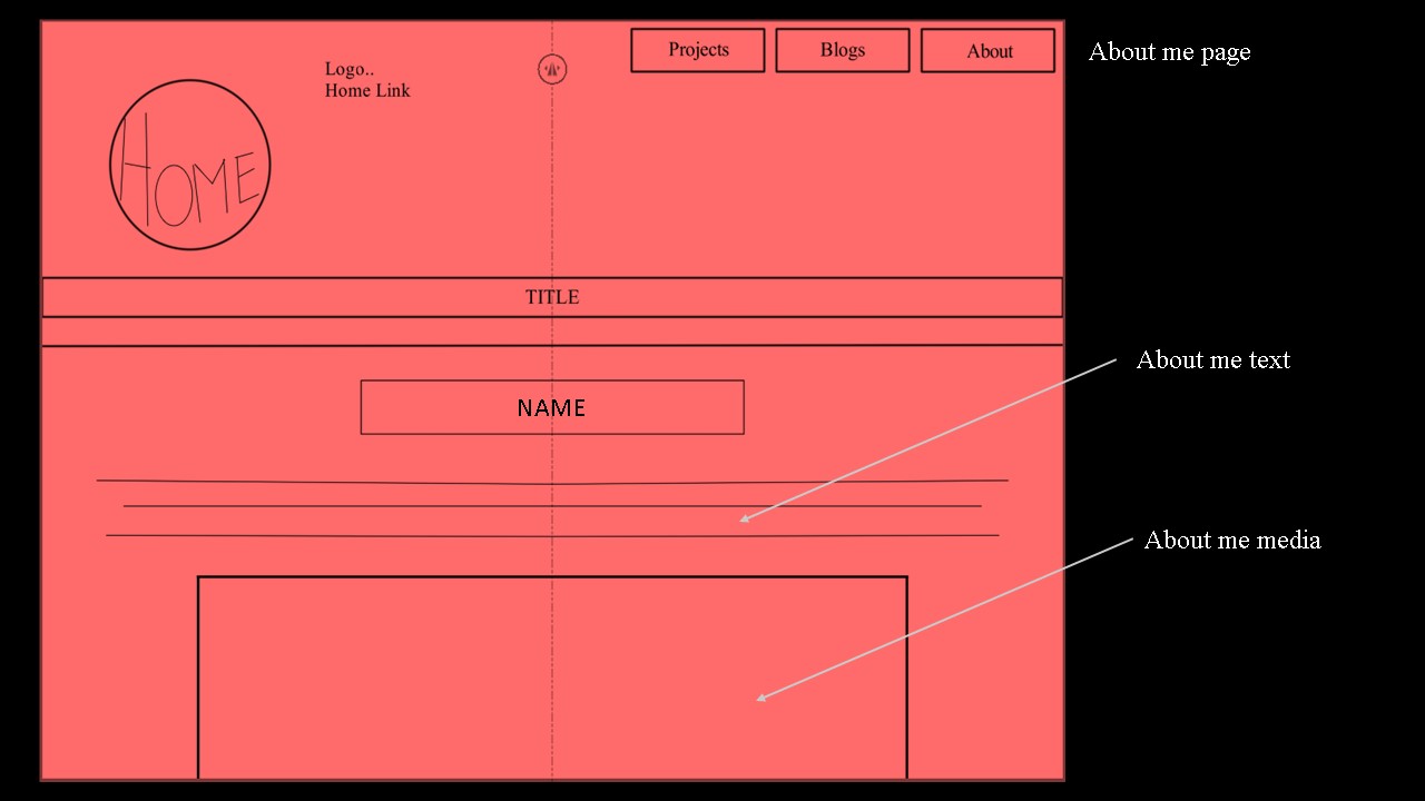
My webpage is an expression of me and my creativity. It follows a vibrant cyber punk theme contrary to the general convention of websites being bland and monotoned. In my design I wanted to break this set convention, while making a functional website that is easy to navigate. While it will be easy to navigate, each section of the website should feel like its own. The way navigation takes place in each section should look and feel different, the exception being the navigation elements on the top of the screen, which is displayed the same on every page with the same functionality. The reason for this is to keep the general aesthetic of the website throughout the website. All navigation elements have a distinctive look and colour way that draws attention to it. All colours used are the same as or a variant of the colours apparent in the background image of the navigation, this image also sets the tone of the website. An additional navigation button appears on every page when a user scrolls down the page, this button allows users to go straight back to the top, this accommodates a satisfactory user experience. All navigation elements have feedback that communicate to the user that it is interactable. For my choice in font I went with something that is thin, clean, and easily readable that suits the neon cyber punk theme. The font is meant to look like text we see on neon billboards in places like Tokyo or Hong Kong. The font I will be using is ‘Text Me One’, part of the sans-serif font-family. This font will only be for the headings and navigation text. For paragraphs I plan on using something more generic like ‘Quicksand’ as it is easy to read in large chunks and does not look overwhelming like the ‘Text Me One’ font.
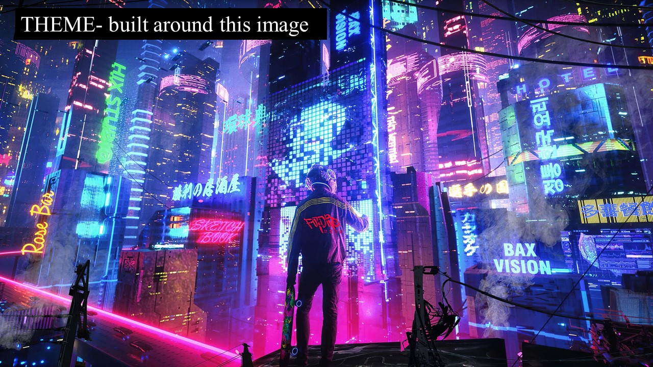
Image taken from hdqwallsit, a website that allows users to download wallpapers for free.
Visit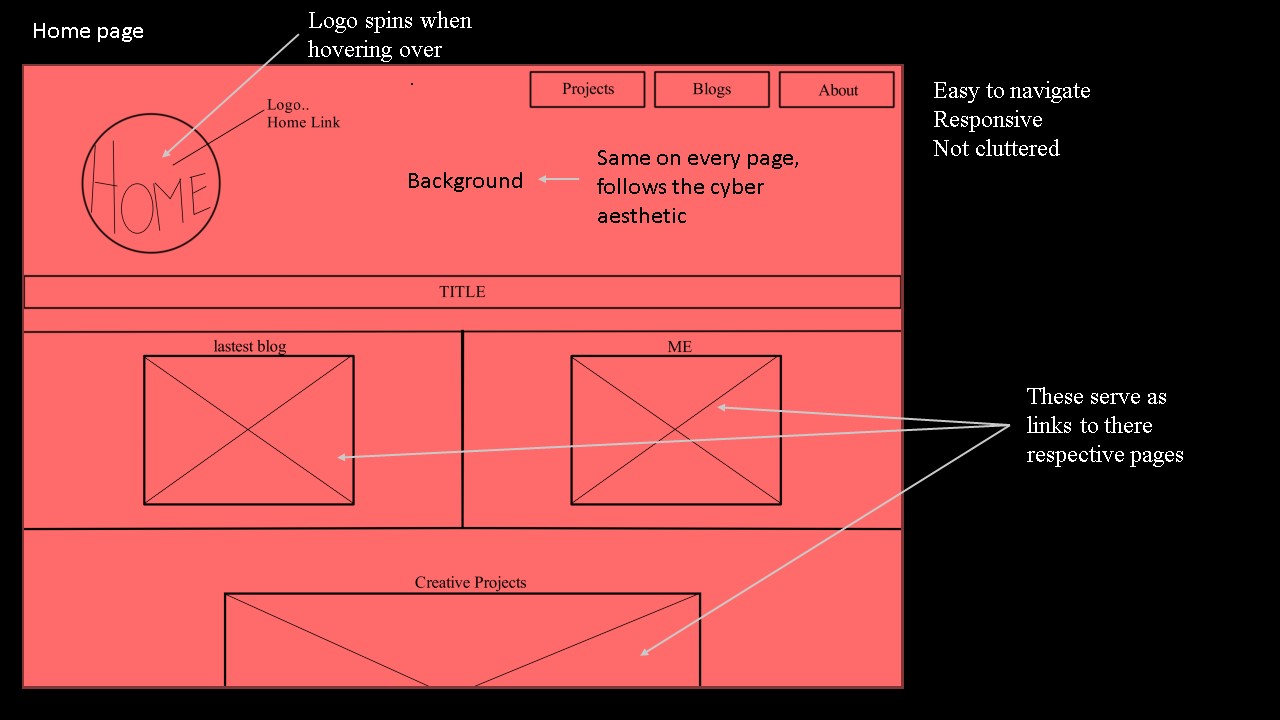
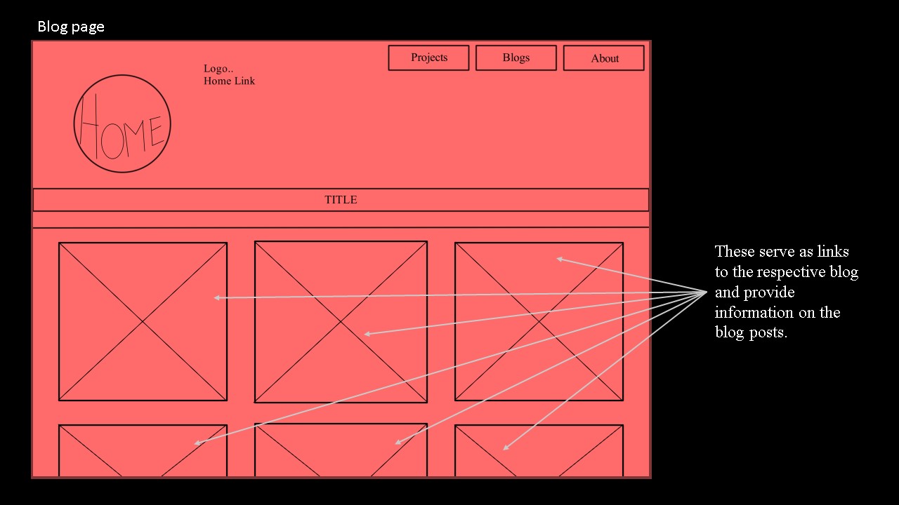
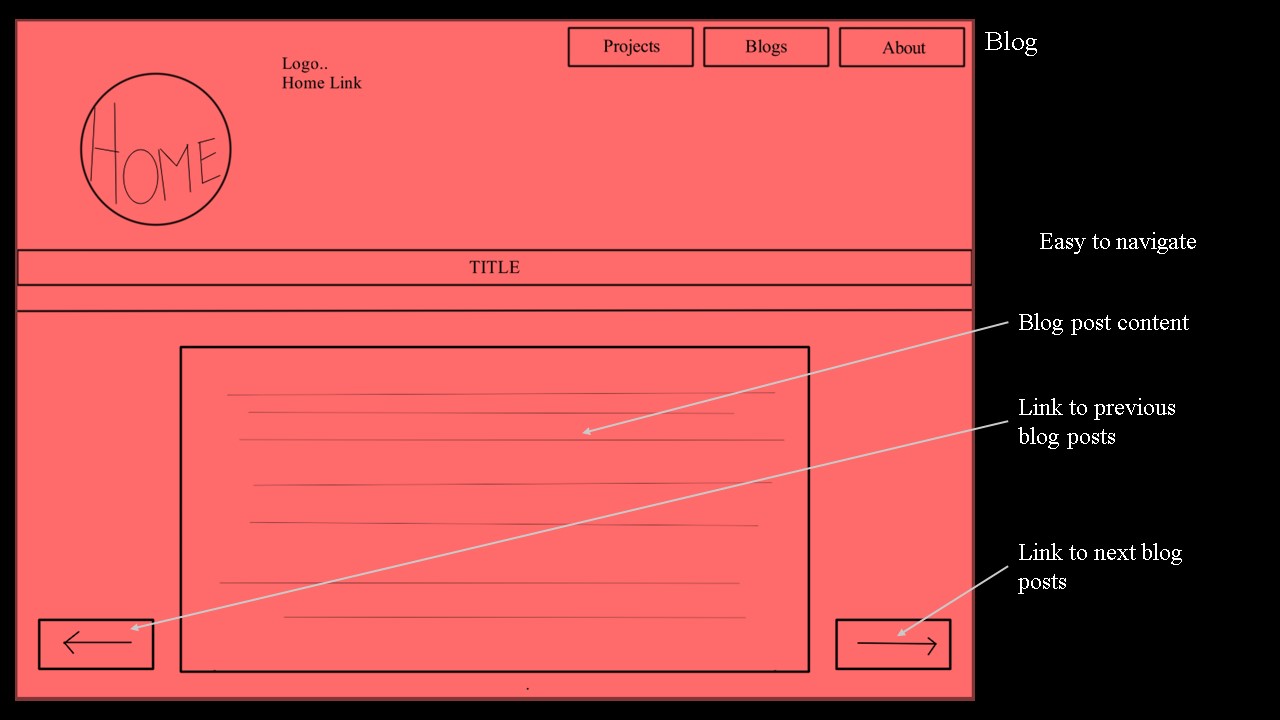
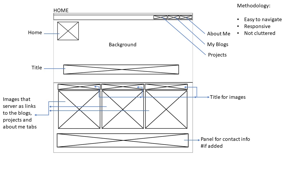
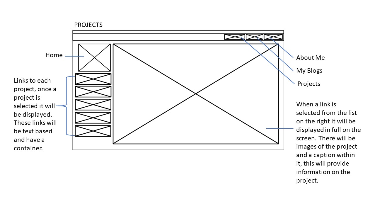
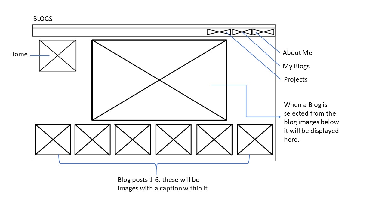
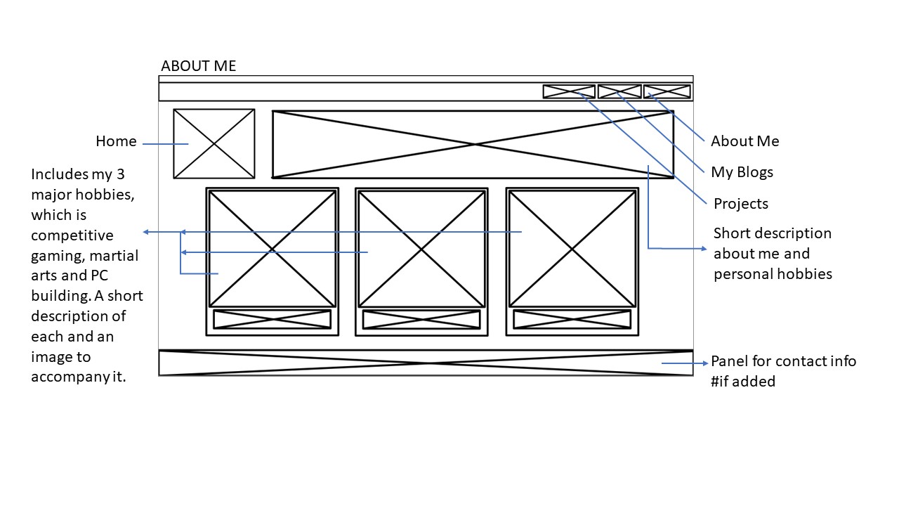
Old WireFrame